
Color Psychology in Home Design: A Practical Guide

TL;DR:
Color psychology guides home design by using specific hues to influence emotions and behavior. Color choices should follow the 60-30-10 rule for balanced palettes and consider lighting, room function, and personal context. Working with professionals helps create cohesive, personalized interiors that promote desired emotional states.
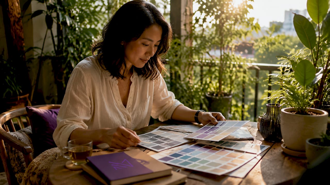
Color psychology in home design is the practice of using specific hues to trigger predictable emotional and behavioral responses in the people who live in a space. People subconsciously judge an environment within 90 seconds, with 62% to 90% of that judgment based on color alone. That single fact changes how you should think about every paint chip, fabric swatch, and finish you choose. The role of colour psychology in home design goes far beyond personal taste. It is a practical tool for shaping how a room feels and functions every single day.
What psychological effects do common colors have in home interiors?
Color psychology, the recognized field of study linking hues to emotional responses, gives homeowners a reliable starting point for color choices for home spaces. The effects are not random. They follow patterns rooted in evolutionary biology, cultural meaning, and personal memory.
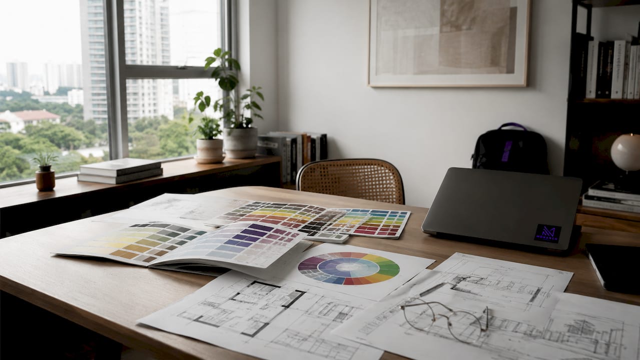
Warm colors, specifically reds, oranges, and yellows, stimulate energy and encourage social interaction. That is why a terracotta dining room or a golden-yellow kitchen tends to feel lively and inviting. These tones raise alertness, which makes them well suited to spaces where people gather, talk, and eat.
Cool colors work in the opposite direction. Blues and greens promote calm and sharpen focus, making them the standard recommendation for bedrooms, home offices, and reading nooks. A soft sage green bedroom does not just look restful. It actively reduces mental stimulation, which supports better sleep and concentration.
Red: Raises energy and appetite. Best in dining rooms and accent walls, not bedrooms.
Yellow: Lifts mood and stimulates creativity. Works well in kitchens and creative studios.
Blue: Lowers heart rate and promotes calm. Ideal for bedrooms and bathrooms.
Green: Balances and refreshes. Works in almost every room, especially home offices.
White and light neutrals: Create a sense of space and clarity. Suit small rooms and minimalist styles.
Deep charcoal or navy: Add drama and intimacy. Best used in larger rooms or as accent walls.
Pro Tip: Avoid choosing a color based solely on how it looks in a magazine. The psychological effects of colors shift depending on saturation, the size of the surface, and the light in your specific room.
How to apply color psychology principles: rules for balanced home palettes
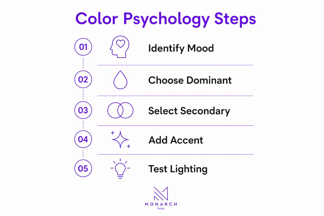
Knowing which colors affect mood is only half the work. Applying them in a way that feels balanced and intentional requires a structured approach. The most widely used framework in professional interior design is the 60-30-10 rule.
60% dominant color: This covers the walls and large surfaces. It sets the overall emotional tone of the room.
30% secondary color: This applies to major furniture pieces and upholstery. It supports and contrasts the dominant tone without competing with it.
10% accent color: This appears in art, cushions, and accessories. It adds visual interest and can be swapped out as trends or moods change.
The 60-30-10 rule gives every room a clear visual hierarchy. Without it, even beautiful individual colors can feel chaotic when placed together.
Undertones are the next critical factor. A color’s undertone significantly affects its visual character. The same base color can read differently depending on whether its undertone is warm, cool, or neutral. A gray with a blue undertone will feel colder and more formal. A gray with a beige undertone will feel softer and more approachable. Matching undertones across your palette is what makes a room feel cohesive rather than accidentally assembled.
Color element | Role in the room | Example |
Dominant (60%) | Sets emotional tone | Soft white or warm greige on walls |
Secondary (30%) | Supports and grounds | Charcoal sofa or walnut cabinetry |
Accent (10%) | Adds energy and personality | Mustard cushions or brass fixtures |
Pro Tip: Always test paint samples directly on your walls and observe them at different times of day. Colors look dramatically different under morning light versus evening lamplight, and paint samples on walls are the only reliable way to see the true result before you commit.
What nuances affect color psychology in home design?
Color psychology gives you a strong foundation, but three factors modify how any color actually performs in your home: lighting, room function, and personal context.
Lighting is the most underestimated variable. South-facing rooms receive warm, bright light that makes colors appear richer and more saturated. North-facing rooms receive cooler, indirect light that can make the same color appear flat or even slightly gray. A warm cream that looks inviting in a sun-drenched living room can feel dingy in a north-facing study. Room orientation is not a minor detail. It is a primary design variable.
Room function determines which emotional atmosphere you need. A home gym benefits from energizing warm tones that raise alertness. A meditation room or nursery calls for the opposite. Interior designers focus on creating mood and atmosphere rather than following universal color charts. The question is not “what color is popular?” but “what does this room need to do for the person using it?”
Lighting type matters: Warm LED or incandescent bulbs amplify warm tones. Cool daylight bulbs can make warm colors appear more neutral.
Texture changes color: Matte finishes absorb light and make colors appear deeper. Gloss finishes reflect light and make the same color appear brighter.
Adjacent colors shift perception: A pale blue next to white reads as calm. The same blue next to a deep navy reads as a soft accent.
“Homeowners should think of color as a tool to shape atmosphere and routine, focusing on desired emotional states rather than fixed rules.” — Colour psychology in interior design
Personal and cultural factors modify color effects in ways that no universal chart can fully predict. Red signals luck in many East Asian cultures and danger in others. White is associated with cleanliness in some contexts and mourning in others. Your personal history with a color matters too. A shade that reminds you of a childhood home you loved will feel comforting regardless of what a color chart says. The most effective color choices combine psychological principles with honest self-knowledge.
How can homeowners collaborate with professionals to use color psychology well?
Applying color psychology effectively across an entire home is a layered process. Working with experienced interior designers and carpenters makes the difference between a palette that looks good in theory and one that works in daily life.
Interior designers use mood board creation as a core tool for translating color psychology into concrete decisions. A mood board tests how your chosen colors, materials, and finishes interact before anything is purchased or painted. It reveals clashes and opportunities that are impossible to see when evaluating colors in isolation.
Carpenters and material specialists play an equally important role. The finish on your cabinetry, the tone of your timber flooring, and the sheen on your built-in shelving all carry color. A warm oak floor will shift the entire emotional character of a room, even if the walls are a neutral white. Carpentry in home design is not separate from color planning. It is part of it.
Start with the room’s purpose. Define the emotional goal first, then choose colors that support it.
Build a cohesive palette across rooms. Use a shared undertone or anchor color to create visual flow from one space to the next.
Plan for flexibility. Keep dominant and secondary colors muted and long-lasting. Use the 10% accent layer for bolder, trend-driven choices that can be updated affordably.
Budget for samples and testing. Spending time and a small amount of money on paint samples before committing saves significant cost and regret later.
Monarch carpenters works with homeowners across Singapore to bring color psychology into real renovation and new home projects. The studio’s in-house designers and carpenters collaborate closely with clients to select palettes, finishes, and materials that work together as a unified whole. Clients consistently note that the results feel both considered and personal, not like a generic showroom.
Key Takeaways
Color psychology is the most cost-effective design tool available to homeowners because it shapes how a space feels without requiring structural changes.
Point | Details |
Color drives first impressions | 62%–90% of a room’s subconscious assessment is based on color within 90 seconds. |
Use the 60-30-10 rule | Distribute color as 60% dominant, 30% secondary, and 10% accent for visual balance. |
Lighting changes everything | Test paint samples in your actual room across different times of day before committing. |
Personalize beyond the chart | Cultural background and personal memory modify how colors feel, so individualize your choices. |
Collaborate for best results | Designers and carpenters help align color, material, and finish into a cohesive, functional palette. |
Why color psychology works best when it is personal
I have seen homeowners walk into a beautifully designed room and feel nothing. The colors were technically correct. The palette was balanced. The undertones matched. But the space did not connect with the person living in it.
That experience taught me something that color charts cannot. Color psychology is a starting point, not a prescription. The research on warm tones and cool tones is real and useful. But the moment you apply it without accounting for the individual, you get a room that looks designed and feels empty.
What I have found actually works is this: start with how you want to feel in the room, not with a color. If you want to feel focused, calm, or energized, work backward from that goal. Then use the psychological guidelines to narrow your palette. After that, test obsessively. Pin large samples to the wall. Live with them for a week. Look at them at 7 a.m. and at 10 p.m.
Low- to mid-saturation shades are almost always the right call for dominant surfaces. They age well, they do not cause visual fatigue, and they give you room to add personality through accents. Bright, saturated colors belong in the 10% accent layer where they can be changed without repainting a room.
The homeowners I have seen most satisfied with their spaces are the ones who worked with professionals they trusted, asked honest questions about their own preferences, and resisted the pressure to follow trends. Color psychology gives you the framework. Your life gives it meaning.
— Seth Wayne
Color-driven design at Monarch carpenters
Monarch carpenters brings together interior design expertise and bespoke carpentry to create homes where color, material, and function work as one. The studio has built a strong reputation in Singapore for delivering mood-enhancing interiors at modest costs, with clients regularly praising the quality of design and the collaborative process.
If you are planning a renovation or new home and want color psychology applied thoughtfully from the first consultation to the final finish, Monarch carpenters is the team to call. Visit monarchcarpenters.com to see the studio’s work, read client feedback, and start a conversation about your space.
FAQ
What is color psychology in home design?
Color psychology in home design is the practice of selecting colors based on their proven emotional and behavioral effects on occupants. It uses research on how hues influence mood, energy, and focus to make deliberate design decisions.
Which colors are best for a bedroom?
Cool tones like soft blue, sage green, and muted lavender are best for bedrooms because they promote calm and focus. Avoid highly saturated warm colors, which raise alertness and can disrupt sleep.
What is the 60-30-10 rule in interior design?
The 60-30-10 rule divides room color into 60% dominant (walls), 30% secondary (furniture), and 10% accent (accessories). This distribution creates visual balance and prevents any single color from overwhelming the space.
Does lighting affect how paint colors look?
Yes. South-facing rooms make colors appear warmer and brighter, while north-facing rooms make the same colors look cooler and darker. Always test paint samples in your actual room before deciding.
Should I follow color psychology rules strictly?
No. Psychological color effects vary by individual, culture, and personal history. Use the guidelines as a framework, then personalize based on how you actually want to feel in the space.
Recommended
Comments