
Interior Design Mood Board Creation for Homeowners
- Monarch

- May 21
- 9 min read
Starting a home renovation or redesign without a mood board is like packing for a trip without knowing your destination. Interior design mood board creation gives you a concrete visual reference before a single piece of furniture is purchased or a wall is painted. It closes the gap between the ideas floating in your head and the actual decisions you need to make. This guide walks you through everything, from understanding what a mood board is and why it matters, to building one that genuinely drives your project forward, whether you are redesigning a single bedroom in a Toa Payoh HDB flat or planning a full condo refresh.
Table of Contents
Key takeaways
Point | Details |
Start with a clear brief | Define the room’s purpose, mood, and style before collecting any images or materials. |
Curation beats volume | A focused board with 10 to 15 well-chosen visuals communicates more than 50 random images. |
Separate direction from execution | Keep aesthetic inspiration distinct from product-specific references to maintain clarity. |
Use digital tools for flexibility | Platforms like Canva let you edit, label, and share boards with collaborators quickly. |
Treat the board as a living document | Update it as your design evolves rather than locking it in after the first draft. |
What interior design mood board creation actually means
A mood board in interior design is a curated visual collage that communicates the aesthetic direction and emotional feeling of a space before any physical work begins. Think of it as a translation tool. It converts vague preferences like “I want something warm but modern” into a concrete visual language that you, your family, and any professional you work with can all interpret the same way.
The core elements of any well-built mood board include:
Images: Photographs of rooms, furniture, architectural details, or outdoor spaces that capture the mood you want.
Color swatches: Specific shades that define your palette, from primary wall colors to accent tones.
Textures and materials: Samples or photos of wood grain, marble, fabric weaves, or tile patterns that communicate how the space will feel, not just look.
Typography and labels: Short annotations that explain the intent behind each element, especially useful when sharing with others.
Lifestyle references: Images of people using spaces in the way you envision, which adds emotional context beyond pure aesthetics.
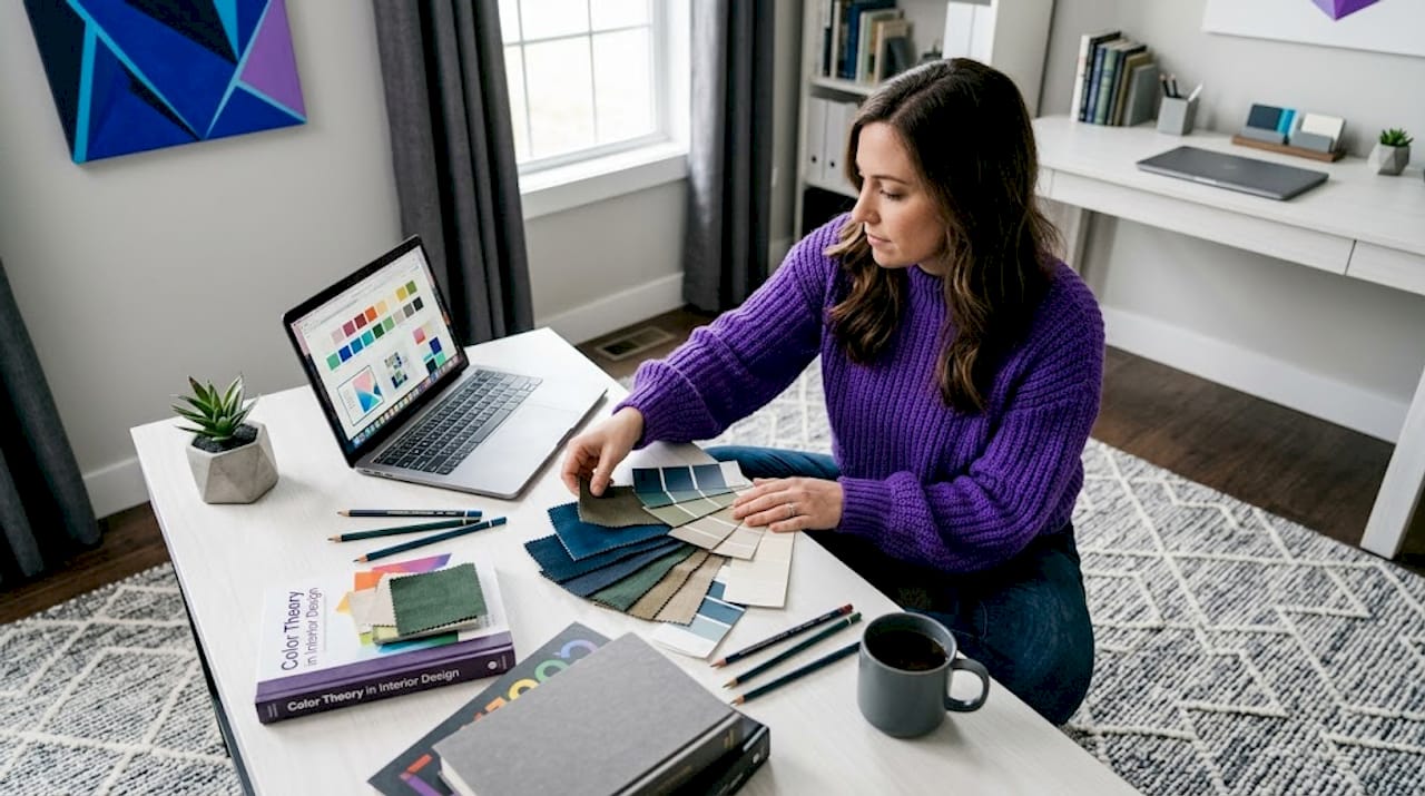
Physical mood boards, where you pin actual fabric swatches and paint chips to a board, are still valuable because they let you see real materials under your home’s lighting. Digital boards, built in tools like Canva or Milanote, are faster to build, easier to share, and simpler to edit as your thinking develops. For most homeowners in Singapore, a digital board is the practical starting point, with physical material samples added as the project matures.
Professional boards separate “direction” from “execution readiness,” keeping style and palette references distinct from specific furniture and lighting choices. This separation prevents the board from becoming cluttered and keeps decision-making clear at every stage.
Before you start: what you need to prepare
Jumping straight into collecting images is the most common mistake homeowners make. Preparation shapes the quality of everything that follows.
Define the room and its purpose. A home office in Singapore’s humid climate has different material and lighting needs than a living room designed for family gatherings. Write down one or two sentences describing how you want the room to feel and function. “A calm, focused workspace with natural light and minimal visual noise” is a brief that immediately filters out irrelevant inspiration.
Choose a design direction. You do not need to commit to a single rigid style, but you do need a dominant direction. Japandi, tropical modern, Scandinavian minimalism, and mid-century modern are all popular choices among Singapore homeowners right now. Mixing styles works when you have a clear hierarchy: one primary style and one secondary influence, not three competing aesthetics.
Build your color palette first. This is the single step most people skip, and it costs them hours of rework later. Define your room goals before building your color palette, then select your style, and only then start collecting images. A palette of three to five colors, including one neutral base, one mid-tone, and one accent, gives every image you collect a filter to pass through.
Here is a quick preparation checklist before you open any design tool:
Room name and primary function confirmed
Design style direction chosen (with one secondary influence if desired)
Color palette of three to five shades selected
List of key furniture pieces or fixtures that must be included
Preferred material finishes noted (matte vs. gloss, warm wood vs. cool stone)
Inspiration sources identified (Pinterest boards, Instagram saves, magazine tears)
Pro Tip: Before collecting images, screenshot or save at least five spaces you genuinely love and five you strongly dislike. The “no” list is often more revealing than the “yes” list and will sharpen your brief faster than any style quiz.
For digital tools, Canva is the most accessible starting point for homeowners with no design background. StudioBinder’s mood board creator supports image search, cropping, annotation, and collaborative sharing, making it well-suited for projects involving multiple decision-makers. Milanote works well for those who prefer a more freeform, pinboard-style layout.
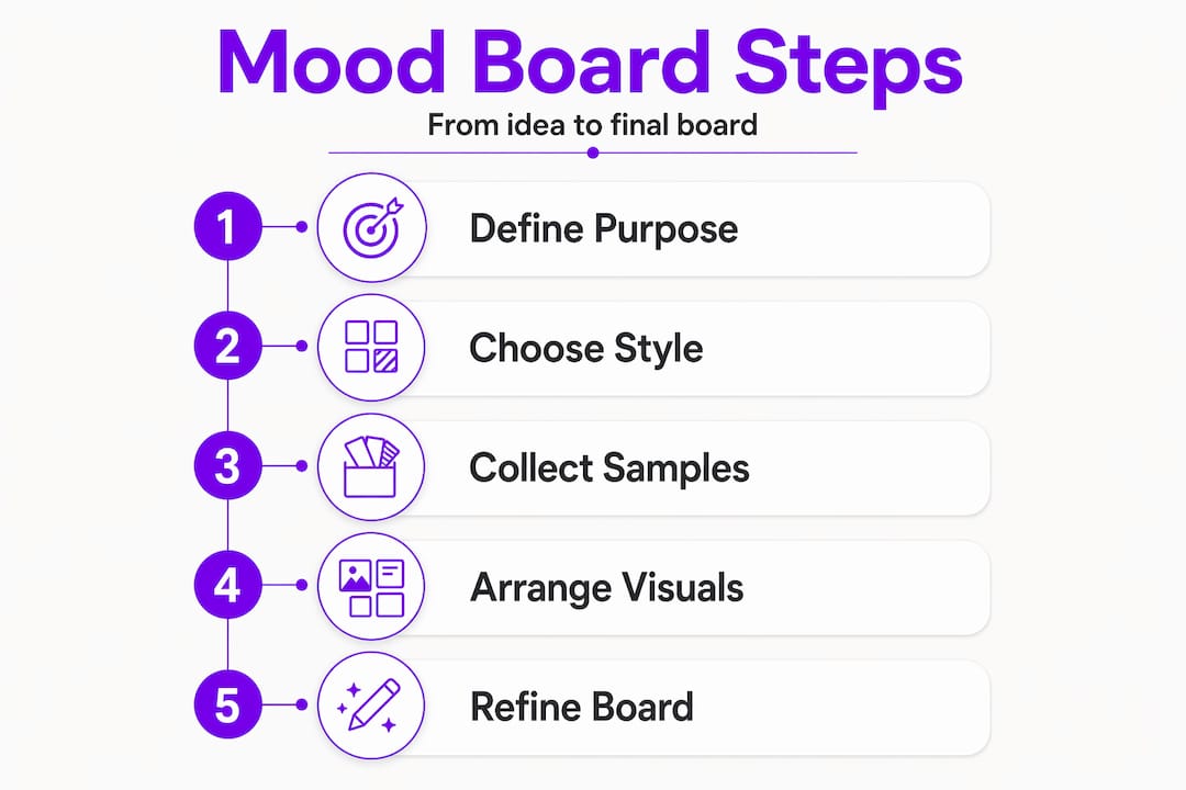
Step-by-step: how to create your mood board
With your brief and palette ready, the actual building process becomes much more focused. Follow these steps to move from concept to a polished, usable board.
Open a blank canvas and set your dimensions. For digital boards, a landscape format at 1920 x 1080 pixels works well for screen presentations. If you plan to print, use A3 at 300 dpi.
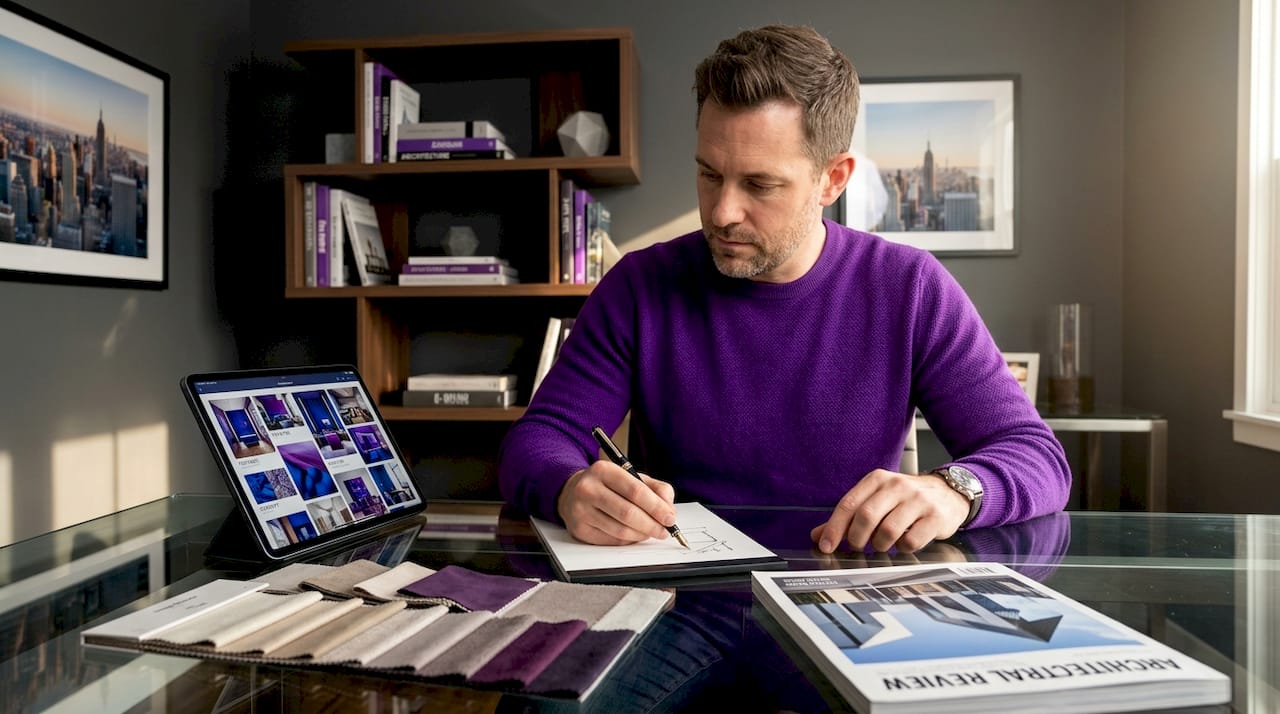
Place your anchor image first. This is the single image that best captures the overall mood you are after. It might be a full room shot, a detail of a material, or even a landscape photograph. Everything else on the board should feel like it belongs in the same world as this image.
Add your color palette as swatches. Place these prominently, usually along one edge of the board. Label each swatch with its hex code or paint reference so you can source it accurately later.
Layer in supporting visuals. Add furniture silhouettes, lighting fixtures, textile close-ups, and flooring samples. Aim for balanced spacing and consistent image style throughout. Mixing high-resolution professional photos with blurry phone screenshots undermines the board’s credibility.
Include texture and material references. Texture-forward mood boards are particularly important in interior and spatial design because they communicate how a space will feel underfoot and to the touch, not just how it will photograph.
Add short labels. A two to four word label under each image, such as “main wall finish” or “sofa fabric direction,” reduces confusion when you revisit the board weeks later or share it with a contractor.
Remove backgrounds where needed. Clean, background-free product images sit more naturally on a board than cluttered room shots. Canva’s background remover handles this in seconds.
Run the three-pass curation loop. The collect, cut, and add method works like this: first, collect quickly without judgment; second, remove any image that conflicts with your palette or brief; third, add execution-supporting pieces like specific furniture or lighting that you are seriously considering purchasing.
Tool | Best for | Collaboration | Cost |
Canva | Beginners, clean layouts | Yes, link sharing | Free and paid tiers |
Milanote | Freeform, research-heavy boards | Yes, team workspaces | Free and paid tiers |
StudioBinder | Annotation and client review | Yes, comments and favorites | Paid plans |
Initial inspiration gathering | Limited | Free |
Pro Tip: After finishing your first draft, step away for 24 hours. When you return, cover the labels and ask yourself whether the board communicates the intended mood without any words. If it does not, the images are doing too little work.
Common mistakes that undermine your mood board
Even well-intentioned boards can fail to communicate clearly. Here are the pitfalls to watch for and how to correct them.
Over-collecting. More images do not mean more clarity. Curation matters more than volume for successful mood boards. Aim for 10 to 15 images maximum on a single board.
Ignoring visual consistency. Mixing photographic styles, such as flat lay shots alongside dramatic architectural photography, creates visual noise. Choose one dominant image style and stick to it.
Skipping the editing pass. The first draft is always too full. The curation loop that cuts conflicting pieces is where the real quality of a mood board is built.
Forgetting practical constraints. A mood board full of marble surfaces and floor-to-ceiling glass looks stunning but may be incompatible with your budget or your building’s structure. Ground every aesthetic choice in at least one practical consideration.
Locking the board too early. Treat your mood board as a proposal that invites feedback rather than a fixed decision. Presenting boards as open proposals encourages refinement and alignment with everyone involved.
Pro Tip: Print a small version of your mood board and tape it inside the room you are redesigning. Living with it for a week in the actual light conditions of that space will reveal mismatches that a screen never shows.
Using your mood board to drive real decisions
A mood board only earns its keep when it connects directly to purchasing and execution decisions. Including sourcing details, such as product links, supplier names, or price ranges, transforms your board from a pretty collage into a working planning document.
When presenting your board to family members or collaborators, frame it as a direction rather than a final answer. This opens the door to useful feedback without triggering defensive reactions. Ask specific questions: “Does this palette feel too cool for a bedroom?” or “Is this level of wood grain too heavy for the space?” Specific questions get specific answers.
As your project moves into procurement, use the board to cross-check every purchase. If a sofa you love does not match any color or material on your board, that is a signal worth pausing on, not ignoring. The board’s job is to keep your decisions coherent across weeks or months of shopping and sourcing, a period when it is very easy to drift from your original vision.
Update the board when your thinking genuinely changes, not just when you find something new and shiny. At Monarchcarpenters, we have seen many homeowners maintain design cohesion through long renovation timelines precisely because they kept a living mood board that reflected real decisions rather than wishful thinking.
My take on mood boards after years in the field
I have worked alongside homeowners and designers on projects ranging from compact HDB renovations to full landed property builds, and the pattern is consistent. The projects that stay on budget and finish with the fewest regrets are almost always the ones where someone took the time to build a clear, curated mood board before any work started.
What I have found is that most people underestimate how much a mood board does beyond aesthetics. It is a decision-making filter. When you are standing in a tile showroom looking at 200 options, a clear mood board cuts that to five. That clarity saves hours and reduces the emotional fatigue that leads to expensive impulse decisions.
The digital versus physical debate is real but not complicated. Start digital for speed and flexibility. Add physical swatches once you have narrowed down to two or three material options. The combination gives you both the big picture and the tactile reality check.
My honest advice: spend more time on the brief than on the board itself. A sharp brief produces a focused board in two hours. A vague brief produces a cluttered board after ten hours of work, and it still will not tell you what to buy.
— Seth
How Monarchcarpenters brings your mood board to life
At Monarchcarpenters, we work with homeowners across Singapore who arrive with mood boards at every stage of development, from rough Pinterest collections to polished Canva presentations. Our in-house team of designers and carpenters uses your mood board as a genuine starting point, translating aesthetic direction into bespoke carpentry solutions, material specifications, and spatial layouts that hold together from concept to completion. We do not just build what you show us. We ask the right questions to make sure what gets built matches what you actually envisioned. If you want to see how mood board concepts translate into finished spaces, explore our completed projects for real examples of the process in action. When you are ready to move from planning to building, we are here to help.
FAQ
What is an interior design mood board?
An interior design mood board is a curated visual collage of images, colors, textures, and material references that communicates the intended aesthetic and emotional direction of a space before any physical work begins. It helps align everyone involved in a project around a shared visual language.
What should I include in a mood board?
A strong mood board includes anchor images, a defined color palette with swatches, texture and material references, furniture or fixture visuals, and short labels explaining each element. Keeping it to 10 to 15 carefully chosen items produces a clearer result than filling the board with every image you like.
What are the best tools for creating a mood board?
Canva is the most accessible option for homeowners with no design background, offering templates, a background remover, and easy sharing. Milanote suits freeform, research-heavy workflows, while StudioBinder adds annotation and collaboration features useful for projects with multiple decision-makers.
How do I know if my mood board is working?
Cover all the labels and ask whether the board communicates its intended mood through images alone. If the feeling is unclear or inconsistent, the curation needs another editing pass. A board that communicates clearly without words is ready to guide real decisions.
When should I update my mood board?
Update your mood board when your design direction genuinely shifts, such as when a key material becomes unavailable or your budget changes, rather than every time you find a new image you like. Keeping the board anchored to real decisions prevents it from drifting away from your original vision.
Recommended
Comments