
Neutral Colors in Small Homes: A Room-by-Room Guide

TL;DR:
Neutral colors help small homes appear larger and calmer by reflecting light and creating tonal harmony. Proper selection of Light Reflectance Value and matching undertones to natural light are crucial for achieving an open, intentional space. Layering textures and tonal variations prevents flatness, making compact interiors feel thoughtfully curated and visually inviting.
Neutral colors are defined as the primary design tool for making small homes feel larger, calmer, and more cohesive. The role of neutral colors in small homes goes beyond aesthetics. By manipulating Light Reflectance Value (LRV), the technical measure of how much light a paint color bounces back into a room, the right neutral shade can visually expand a compact space by a meaningful margin. Tonal layering and texture prevent the flatness that gives neutral interiors a bad reputation. When chosen and applied with care, a neutral color palette transforms a tight floor plan into a space that feels intentional, airy, and genuinely comfortable.
How does Light Reflectance Value affect neutral colors in small homes?
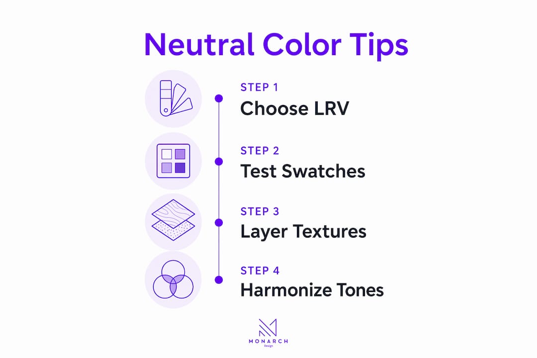
Light Reflectance Value is the single most important technical metric when choosing paint for a small home. The LRV scale runs from 0 (pure black, absorbs all light) to 100 (pure white, reflects all light). Every paint color sits somewhere on that scale, and the number directly determines how spacious a room feels.
Tiny homes under 400 sq ft need neutrals with an LRV of 65–80 to achieve maximum light reflection. That range keeps walls bright without looking clinical. Small apartments in the 400–800 sq ft range benefit from LRV values of 55–75, which balance brightness with warmth and prevent the space from feeling sterile.
Paint with an LRV below 50 makes a small room feel noticeably smaller. The walls appear to close in because they absorb more light than they return. This is why a charcoal accent wall that looks dramatic in a showroom can feel suffocating in a 350 sq ft studio.
Room size | Recommended LRV range | Effect |
Under 400 sq ft | 65–80 | Maximum light reflection, airy feel |
400–800 sq ft | 55–75 | Balanced brightness and warmth |
Over 800 sq ft | 45–65 | Richer tones without shrinking space |
Below 50 (any size) | Avoid in small rooms | Absorbs light, reduces perceived size |
Pro Tip: Always check the LRV number on the paint manufacturer’s data sheet before purchasing. Most major paint brands list it alongside the color chip. If it is not listed, ask the store associate to look it up.
What role does room orientation play in choosing neutral shades?
The direction a room faces determines how much natural light it receives and what color temperature that light carries. Matching your neutral undertone to that light is what separates a wall that looks fresh from one that looks muddy.

North and east-facing rooms receive cooler, less intense light throughout the day. Cool neutrals such as blue-grays, crisp whites, and soft greiges with gray undertones perform best in these rooms. They work with the cooler light rather than fighting it, keeping the space feeling clean and open.
South and west-facing rooms get warmer, more intense light, especially in the afternoon. Warm neutrals, including creamy whites, soft taupes, and greiges with yellow or beige undertones, soften that intensity. They prevent the room from feeling washed out or overly bright at peak sun hours.
Key principles for matching undertones to light:
Test paint samples directly on your wall, not on paper or a small chip held up to the light.
Observe the sample at three different times: morning, midday, and evening.
Check how the sample looks next to your flooring and fixed cabinetry, since floor color shifts how a wall neutral reads.
Artificial lighting matters too. LED bulbs with a color temperature of 2700K–3000K cast warm light that flatters warm neutrals. Cooler LEDs at 4000K and above suit cool neutrals better.
Incandescent bulbs add a yellow cast that can make cool neutrals appear greenish or dingy.
Pro Tip: Paint a large swatch, at least 12 inches by 12 inches, directly on the wall and live with it for three full days before committing. Colors appear darker on walls than on paint chips, and lighting shifts will reveal undertones you cannot see in a store.
The natural light in your home is the single biggest variable in how a neutral reads. Getting the undertone right is not guesswork. It is observation.
How do you layer textures and tonal variations in a neutral small home?
A single flat neutral across every surface is the fastest way to make a small home feel like a waiting room. The fix is tonal layering, which means using three to five harmonious neutral shades with consistent undertones across walls, furniture, and textiles.
Rooms with three to five harmonious neutrals read as more expensive and intentional than rooms painted a single shade. The eye has enough variation to stay engaged without being pulled in competing directions. The key is keeping all shades within the same undertone family. Mixing a warm beige wall with a cool gray sofa creates visual tension that makes a small room feel cluttered even when it is tidy.
Paint finish plays a critical role in this layering. Eggshell finish is the standard choice for small walls because it reflects soft, diffused light without highlighting surface imperfections. Matte finishes absorb light and make colors appear heavier. Semi-gloss amplifies every bump and brush mark, so reserve it for trim and cabinetry on well-prepped surfaces only.
Effective texture combinations for neutral small homes:
Walls: Eggshell paint in a base neutral, or a subtle plaster texture in a slightly deeper tone of the same family.
Soft furnishings: Linen cushions, a wool throw, and a cotton rug in tonal variations of the wall color.
Hard surfaces: Light oak or ash wood furniture, which adds warmth without introducing a competing color.
Ceiling: Paint the ceiling the same neutral as the walls or one shade lighter. Ceilings painted the same neutral as walls appear higher, and the eye moves smoothly through the space.
Accents: Woven baskets, ceramic vessels, and unbleached linen curtains add depth without breaking the tonal palette.
The goal is for the eye to travel through the room without stopping. Texture creates that movement. Color contrast stops it. Understanding the role of textures in interior design is what separates a flat neutral room from one that feels genuinely curated.
Neutral tones also serve as visual rest in multi-functional small spaces. Studio apartments and compact open-plan homes carry a lot of activity in a tight footprint. A cohesive neutral palette reduces the mental load of that density, making the space feel calmer even when it is fully furnished.
Practical tips for applying neutral colors in small homes
Applying a neutral palette well requires a clear sequence. Jumping straight to paint without a plan leads to mismatched undertones, awkward contrasts, and rooms that feel smaller than they did before.
Start with walls and ceiling. Choose one base neutral and apply it to both surfaces. This single step removes the visual break between wall and ceiling, which is the most effective way to increase perceived room height.
Choose the palest version of your desired hue. Colors always appear more saturated on a large wall than on a small chip. Starting with the lightest option preserves the airy effect you are after.
Select mid-tone neutrals for furniture. A sofa or bookcase in a mid-tone neutral grounds the room without competing with the walls. Avoid going darker than two shades below your wall color in a very small room.
Use eggshell finish on walls. Eggshell reflects light softly and is easy to clean. Reserve matte for ceilings and semi-gloss for trim only.
Incorporate built-in storage. Clutter breaks visual continuity faster than any wrong paint choice. Built-in cabinetry in the same neutral as the walls keeps storage invisible and the palette intact.
Match fixed elements to the palette. Flooring, kitchen cabinetry, and bathroom tiles are harder to change than paint. Choose a neutral that works with what you already have rather than fighting it.
Avoid harsh contrasts. A single dark accent wall in a small room creates a visual stop that shrinks the space. If you want depth, use a tone two shades deeper in the same neutral family, not a contrasting color.
Pro Tip: Before buying full cans of paint, order sample pots and apply large swatches next to your flooring and furniture. Live with them for a week. The color psychology behind your choices will become clear once you see how the neutral shifts from morning to evening light.
Small space interior design in Singapore and other dense urban environments demands this level of precision. Every square foot counts, and the right neutral palette is one of the most cost-effective tools available to a homeowner.
Key Takeaways
Neutral colors work in small homes because they reflect light, reduce visual clutter, and create tonal continuity that makes compact spaces feel larger and calmer.
Point | Details |
LRV determines effectiveness | Choose neutrals with LRV 65–80 for rooms under 400 sq ft to maximize light reflection. |
Undertone must match light direction | Use cool neutrals in north/east rooms and warm neutrals in south/west rooms to avoid muddy results. |
Tonal layering prevents flatness | Use three to five harmonious neutrals across walls, textiles, and furniture within the same undertone family. |
Eggshell finish is the standard | Eggshell reflects soft light on small walls without amplifying surface imperfections. |
Test before you commit | Paint large swatches on the actual wall and observe them across three days and multiple lighting conditions. |
Why most homeowners get neutral colors wrong
Most homeowners treat neutral as a safe default rather than a deliberate choice. That is where the trouble starts. I have seen dozens of small homes where the owner picked a “warm white” from a chip at the store, painted the entire apartment, and then wondered why the room felt dingy. The culprit was almost always an undertone mismatch. The paint had a yellow undertone, the flooring was cool gray, and the two fought each other constantly.
The second most common mistake is skipping texture entirely. A single flat neutral on every surface, same finish, same shade, reads as unfinished rather than minimal. Depth comes from layering linen against plaster against light wood. Without that variation, the room has nowhere for the eye to rest comfortably.
The third mistake is impatience. Homeowners test a chip, like it, and paint the whole room in a weekend. Then the afternoon light hits and the wall looks green or pink. Sampling slowly, over days and in real conditions, is not optional. It is the work.
What I find most rewarding about working with compact spaces is that the constraints force precision. You cannot hide a bad color choice behind square footage. Every decision is visible. When the undertones align, the LRV is right, and the textures are layered well, even a 400 sq ft apartment can feel genuinely generous. Monarch carpenters approaches every small home project with exactly this level of care, and the feedback from clients consistently reflects how much that precision matters in the final result.
Neutrals are not boring. They are the most demanding palette to execute well. Get them right, and the space rewards you every single day.
— Seth Wayne
Monarch carpenters: small home design with a neutral palette that works
Homeowners across Singapore have trusted Monarch carpenters to bring exactly this kind of precision to their compact interiors, and the results speak for themselves in client reviews that consistently highlight quality design at a modest cost.

Monarch carpenters specializes in residential interiors where neutral color expertise, bespoke carpentry, and built-in storage solutions work together to maximize every square foot. The team selects neutrals based on LRV data, room orientation, and existing fixed elements, then layers textures through custom joinery and material choices that prevent flatness. Whether you need a full interior design plan or a focused consultation on your neutral palette, Monarch carpenters delivers thoughtful, cost-effective solutions built to last. Explore our interior design services and see how a well-executed neutral palette can change the way your home feels.
FAQ
What is the best neutral color for a small room?
The best neutral for a small room has an LRV of 65–80 for spaces under 400 sq ft. Crisp whites, soft greiges, and pale warm taupes in that range reflect the most light and create the strongest sense of openness.
Do neutral colors really make a small room look bigger?
Yes. Cool neutrals can add a perceived 15–20 sq ft to a room’s apparent size by reflecting more light and reducing visual clutter. The effect is strongest when walls and ceilings share the same neutral.
How do I stop a neutral room from looking flat or boring?
Use three to five harmonious neutrals with consistent undertones across walls, textiles, and furniture. Combine matte, eggshell, and light gloss finishes, and introduce materials like linen, wool, light wood, and plaster to create texture and depth.
Should I paint the ceiling the same color as the walls?
Painting the ceiling the same neutral as the walls, or one shade lighter, makes the ceiling appear higher and lets the eye move smoothly through the space. This technique is one of the most effective ways to increase perceived room height in a compact home.
How do I choose between warm and cool neutrals?
Match the undertone to your room’s light direction. North and east-facing rooms suit cool neutrals like blue-grays and crisp whites. South and west-facing rooms benefit from warm neutrals like creamy whites and soft taupes that soften intense afternoon light.
Recommended
Comments