
The Role of Textures in Interior Design: 2026 Guide

TL;DR:
Texture in interior design influences how rooms feel, function, and communicate emotion through surface qualities.
It controls color perception, spatial experience, and acoustic comfort, making spaces more inviting and balanced.
Texture in interior design is defined as the combination of tactile and visual surface qualities that shapes how a room feels, functions, and communicates emotion. The role of textures in interior design goes far beyond decoration. Texture changes how colors read under light, how sound moves through a room, and how physically comfortable a space feels to live in. Industry trend reports recognize that organic, layered textures support mental well-being and ease digital fatigue in homes. The 70-20-10 rule, a widely used design framework, gives homeowners a practical starting point for balancing textural elements without creating visual chaos.
How does texture influence the perception of color and space?
Texture is the single most underestimated variable in color and spatial planning. Most homeowners focus on paint swatches and furniture dimensions, but the surface quality of every material in a room quietly controls the final result.
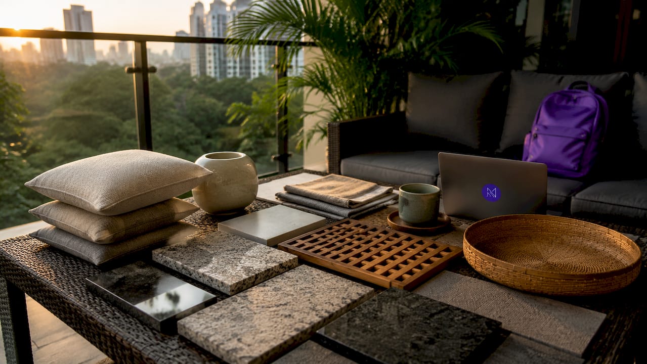
Matte surfaces absorb light, making colors appear richer and deeper. Glossy surfaces reflect light, making the same color look lighter and more saturated. This means a navy linen sofa and a navy lacquered cabinet will read as two completely different shades in the same room, even though the base color is identical.
Texture also shapes spatial perception. Rough, heavy textures like exposed brick or chunky knit throws pull walls inward and make a room feel cozier and more intimate. Smooth, reflective surfaces like polished marble or glass push walls outward visually, making a compact Singapore apartment feel more open. Understanding this effect lets you control the perceived size of a room without moving a single wall.
Rough textures (stone, raw wood, woven rattan): absorb light, add warmth, reduce perceived room size
Smooth textures (polished concrete, lacquered panels, glass): reflect light, feel cooler, increase perceived room size
Matte textures (linen, chalk paint, unglazed tile): deepen color, reduce glare, create calm
Glossy textures (ceramic tile, mirror, high-gloss cabinetry): brighten color, increase energy, add drama
Rooms with only flat, smooth surfaces feel cold and clinical regardless of how much money was spent on furniture or color. The fix is not a new sofa. It is adding a contrasting surface quality.
Pro Tip: Hold material samples at arm’s length under your room’s actual lighting before committing. A texture that looks rich in a showroom can disappear entirely under warm LED downlights at home.
What practical rules guide using textures in home interiors?
Design professionals use structured frameworks to mix textures without creating visual noise. The most widely applied is the 70-20-10 rule.
The 70-20-10 texture rule assigns 70% of a room’s surfaces to smooth or matte finishes, 20% to plush or soft textures, and 10% to shiny or raw accent textures. The 70% matte base provides visual calm. The 20% soft layer adds warmth and comfort. The 10% shiny or raw accent creates the focal interest that makes a room feel designed rather than assembled. This ratio prevents any single texture from overwhelming the space.
For smaller rooms or homeowners working with fewer materials, a simplified version works just as well. Limiting a room to three to five distinct textures keeps the palette manageable. The key is intentional contrast, not quantity.
Texture scale matters as much as texture type. Fine, detailed textures work best on surfaces viewed up close, like cushion fabric or a bedside table. Bold, large-scale textures belong on surfaces seen from across the room, like a feature wall or a large area rug. Mismatching scale is one of the most common mistakes in DIY interiors.
Texture type | Best application | Effect |
Smooth/matte (linen, chalk paint) | Walls, large upholstery | Calm, depth, color richness |
Plush/soft (velvet, bouclé, wool) | Cushions, throws, rugs | Warmth, comfort, acoustic softening |
Shiny/reflective (glass, lacquer, metal) | Lighting, hardware, accents | Brightness, focal interest |
Raw/organic (stone, rattan, reclaimed wood) | Feature walls, flooring, shelving | Authenticity, grounding, warmth |
Patterned/visual (wallpaper, fluted panels) | Accent walls, cabinetry fronts | Rhythm, depth without bulk |
Pro Tip: Repeat any texture at least twice in a room. A single bouclé cushion looks like an accident. Two bouclé cushions and a bouclé throw read as a deliberate design choice.
What types of textures create atmosphere and function in a room?
Textures fall into two categories: tactile and visual. Tactile textures are physically felt, like velvet upholstery, rough stone, or a smooth marble countertop. Visual textures are perceived by the eye but not felt, like a wood-grain print on laminate or a patterned wallpaper that mimics woven fabric. Both types shape atmosphere, but they work differently.
Organic and imperfect textures carry particular emotional weight. The wabi-sabi principle, rooted in Japanese aesthetics, holds that aged brass or worn wood adds authentic character and a sense of permanence that no perfectly finished surface can replicate. A reclaimed timber shelf or a hand-plastered lime-wash wall communicates history and craft in a way that flat-painted drywall simply cannot.
Texture also affects acoustics. Fabric, upholstery, and soft furnishings absorb sound and reduce echo. Hard, smooth surfaces like tile and glass reflect sound and increase ambient noise. In an open-plan Singapore home where the living, dining, and kitchen areas share one continuous space, soft furnishings like rugs, curtains, and upholstered seating do real acoustic work, not just decorative work.
Trending textures in 2026 worth knowing:
Fluted panels: Vertical grooves on cabinetry or walls add depth and shadow play without requiring additional materials
Lime-wash walls: A layered, chalky finish that shifts color with light throughout the day, creating a living surface
Raw stone and terrazzo: Brings organic variation and visual complexity to floors and countertops
Bouclé fabric: A looped, nubby weave that reads as warm and tactile even from across a room
Rattan and cane: Open-weave natural materials that add lightness and visual texture without visual weight
Each of these textures earns its place not just by looking good in photographs, but by changing how a room feels to live in daily.
How can homeowners layer textures for cohesive, inviting interiors?
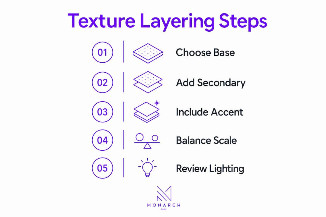
Layering textures means combining multiple surface qualities so they complement rather than compete. The goal is rhythm, not uniformity. A room where every surface shares the same finish level feels flat. A room where every surface fights for attention feels chaotic. The skill is in the balance.
Designer Kristen Bonney-James recommends an “opposites attract” approach: pair bold motifs with subtle patterns within a cohesive color palette. This method allows up to 10 different textures in one room without creating visual messiness. The color palette acts as the unifying thread, so the eye reads harmony even when the surfaces vary widely.
Temperature contrast is another layering tool that most homeowners overlook. Pairing cold marble with warm rugs creates a balanced spatial feel that neither material achieves alone. The marble reads as refined and cool. The rug grounds the space and adds physical warmth underfoot. Together, they create a room that feels both polished and livable.
Room | Primary texture (70%) | Secondary texture (20%) | Accent texture (10%) |
Living room | Smooth plaster walls, linen sofa | Wool rug, velvet cushions | Brass lamp, glass vase |
Bedroom | Matte painted walls, cotton bedding | Bouclé headboard, knit throw | Rattan pendant, ceramic lamp |
Small study | Fluted panel feature wall, timber desk | Linen curtains, upholstered chair | Metal shelving, glass desk lamp |
Open-plan kitchen | Polished concrete floor, flat cabinetry | Timber open shelving, woven stools | Stone splashback, matte black hardware |
Common layering mistakes to avoid: using the same gloss level on every surface, adding textures in only one zone of the room, and choosing textures that photograph well but feel uncomfortable to touch. A room is experienced in person, not on a screen.
Pro Tip: Start with your largest surface, usually the floor or the main wall, and build outward. Every texture you add should either contrast or complement that anchor material. Never add a third texture before the first two are working together.
Key Takeaways
Texture shapes a room’s atmosphere, color perception, and emotional comfort more directly than any other single design variable.
Point | Details |
Texture controls color perception | Matte surfaces deepen color; glossy surfaces brighten it, even with identical paint. |
The 70-20-10 rule prevents chaos | Assign 70% matte, 20% soft, and 10% shiny or raw textures for a balanced room. |
Scale matching matters | Use fine textures on close-up surfaces and bold textures on large, distant surfaces. |
Repetition creates cohesion | Repeat any texture at least twice to signal intention rather than accident. |
Layering needs a color anchor | A unified color palette lets you mix many textures without visual messiness. |
Why texture literacy is the skill most homeowners skip
I have walked through hundreds of finished interiors, and the ones that feel genuinely alive share one quality: the designer understood how surfaces behave, not just how they look in a catalog. That skill is what I call texture literacy, and it is rarer than it should be.
Most homeowners spend hours choosing paint colors and weeks selecting furniture. They spend almost no time thinking about surface quality. The result is rooms that look correct in photographs but feel oddly flat or cold in person. High-resolution photography flattens textures, making spaces appear sterile. Real-world texture layering interacts with natural light in ways no camera fully captures.
The other mistake I see constantly is treating texture as a finishing touch rather than a structural decision. Texture belongs in the brief from day one, alongside the floor plan and the color palette. When you add it at the end, you end up with a smooth, well-colored room that still feels like something is missing.
The good news is that intentional combinations rather than expensive materials create engaging interiors. A lime-wash wall costs less than a stone feature wall and delivers more visual complexity. A bouclé throw costs less than a new sofa and changes the entire emotional temperature of a living room. Texture is the most cost-effective design variable available to any homeowner.
My honest advice: before you buy anything new for a room, spend 10 minutes identifying every texture already present. Count the gloss levels. Notice where the surfaces are all the same. That audit will tell you exactly what the room needs, and it costs nothing.
— Seth Wayne
How Monarch carpenters brings texture to life in your home
Texture-focused design requires more than good taste. It requires the technical skill to specify, source, and install materials that behave exactly as intended in your specific space.

Monarch carpenters brings that skill to every residential and commercial project in Singapore. The studio’s in-house team of designers and carpenters works with clients to select and layer textures across cabinetry finishes, wall treatments, and built-in joinery, all at a cost that consistently earns praise in client feedback. Homeowners regularly highlight the quality of the finished result relative to the investment made. Whether you are planning a new home or refreshing an existing space, Monarch carpenters’ bespoke carpentry and design approach ensures that every surface works together with intention and craft.
FAQ
What is the role of textures in interior design?
Texture defines how a room feels physically and emotionally by controlling light absorption, color depth, acoustic quality, and tactile comfort. It is one of the seven core elements of interior design, alongside color, line, form, space, pattern, and light.
How does texture affect color perception in a room?
Matte textures absorb light and make colors appear richer and deeper, while glossy textures reflect light and make the same color look brighter. This means surface quality changes how a paint color reads, even without changing the paint itself.
What is the 70-20-10 rule for texture in interior design?
The 70-20-10 rule assigns 70% of a room’s surfaces to smooth or matte finishes, 20% to soft or plush textures, and 10% to shiny or raw accents. This ratio balances calm, warmth, and visual interest without creating chaos.
How many textures should a room have?
Most well-designed rooms use three to five distinct textures, though a cohesive color palette can support up to 10 without visual messiness. The key is contrast and repetition: each texture should appear at least twice and pair with at least one complementary surface quality.
What are the most popular textures in interior design right now?
Fluted panels, lime-wash walls, bouclé fabric, raw stone, and rattan are among the most widely used textural elements in 2026. Each adds depth and warmth while supporting the trend toward organic, human-centered living spaces.
Recommended
Comments