
Why Color Scheme Matters in Small Spaces: A Practical Guide
- Monarch
- 4 hours ago
- 13 min read

The right color scheme changes how a small room feels by controlling light reflection, visual boundaries, and where your eye travels. Pick the wrong palette and a compact room feels like a closet. Get it right and the same four walls feel intentional, open, and livable. Three things to do right now: (1) check your primary wall color’s LRV (Light Reflectance Value) and aim for a relatively high level for main walls, (2) decide on a warm or cool undertone based on which direction your windows face, and (3) test a large painted sample on the actual wall before buying a full gallon. Sherwin-Williams and Benjamin Moore both publish named swatches with LRV data, making them reliable starting points. Monarch carpenters’ studio work in Singapore consistently shows that pairing a well-chosen palette with integrated bespoke carpentry multiplies the spatial effect at a modest cost, and clients regularly note that combination in their feedback.
Pick your LRV target first. Walls with a relatively high LRV make rooms feel more open by bouncing significant light back into the space.
Decide undertone before color. Warm vs. cool is the single decision that eliminates most poor matches early.
Sample large, sample in place. Small chips under store lighting are unreliable; a 12-by-12-inch painted patch on your actual wall, checked at three times of day, is the minimum reliable test.
Table of Contents
Why color scheme matters in small spaces: the perceptual mechanics
Color does not just decorate a room. It controls how much light bounces back, how far away surfaces appear, and whether the eye stops or keeps moving. Understanding those three levers is what separates a palette that works from one that shrinks a room further.
LRV is the most useful single number in small-space color decisions. On a scale of 0 (pure black) to 100 (pure white), it measures how much light a surface reflects. A higher LRV is the practical target for main walls when maximum brightness and openness are the goal; lower LRV values are generally reserved for accents or trim. That said, LRV alone does not tell the whole story.
Hue and saturation matter just as much. Cool hues (blue, blue-gray, muted green) visually recede, pushing perceived wall boundaries outward. Warm hues advance, pulling walls closer. Saturation works the same way: a highly saturated color, even a pale one, draws attention to the wall surface and makes the room feel more enclosed. Muted, desaturated tones disappear into the background. The most effective small-room palettes combine high LRV with a cool or neutral hue and low saturation.
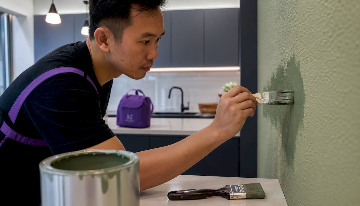
Contrast creates the hardest problem. Every time the eye hits a sharp tonal shift, it registers a boundary. White trim against a medium wall, dark furniture against a pale floor, a bright ceiling against colored walls: each contrast is a visual “stop” that defines the room’s edges and makes it feel smaller. Eye travel distance explains a significant portion of perceived spaciousness variance in controlled studies, which is why reducing those hard stops matters so much.
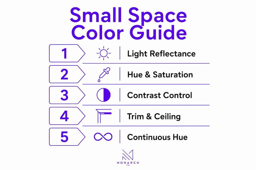
Think of it as a simple diagram: a small square room with high-LRV walls, a ceiling one shade lighter, and trim matched to the walls has no hard perimeter line for the eye to trace. The same room with bright white trim, a stark white ceiling, and medium-tone walls gives the eye four distinct boxes to register. The second version always reads smaller.
Which color families actually make small rooms feel larger?
Soft whites, warm neutrals, light grays, pale blue-grays, and muted sage greens consistently outperform more vivid options in compact spaces. Here are four starter directions, each suited to a different room condition.
Soft white with warm undertones (LRV 80–90). Works well in south- and west-facing rooms where strong light would make a cool white feel stark. Benjamin Moore’s White Dove is a widely cited example in this family.
Pale blue-gray (LRV 65–75). The cool undertone recedes even at moderate LRV, making it one of the most reliable choices for north-facing rooms that need perceived depth rather than warmth. Sherwin-Williams’ Misty sits in this range.
Warm greige or off-white (LRV 70–80). A balanced neutral that reads neither warm nor cold under mixed light. Useful in open-plan studios where the palette must work across multiple exposures. Sherwin-Williams’ Accessible Beige is a frequently referenced starting point.
Muted sage green (LRV 55–68). Lower LRV than the options above, but the cool-neutral hue still recedes. Best in rooms with good natural light and warm-toned floors, where the green reads as calm rather than dim.
For a room-by-room breakdown of how these palettes apply across different spaces, Monarch carpenters’ guide on neutral colors in small homes is a practical next step. The key rule: coordinate undertones across walls, floors, and furnishings early, before narrowing to a specific swatch.
How color drenching removes visual stops and makes rooms feel continuous
Color drenching means painting walls, trim, and often the ceiling the same hue, sometimes in slightly different sheens; for practical guidance on door color choices and finishes that affect visual boundaries, see best color to paint interior doors. The effect is that the eye finds no hard boundary between surfaces, so the room reads as a single continuous volume rather than a box with edges.
Matching walls, trim, and ceiling in one value removes the perimeter cues that define a room’s footprint. Contrasting trim is one of the most common ways homeowners accidentally shrink a small room. A bright white baseboard against a medium-tone wall creates a horizontal line at floor level that the eye reads as a boundary, lowering the perceived ceiling height and emphasizing the room’s limited width.
When to avoid contrasting trim: any room with low ceilings, multiple doorways, or many sightlines benefits from matched or near-matched trim. The visual relief of a white trim is only worth keeping when the room has enough volume to absorb the contrast.
Color drenching is less about choosing a single color and more about removing the edges that tell your brain where the room ends. When those edges disappear, the space feels like it extends beyond what you can measure.
Pro Tip: To decide whether to match your trim or keep it lighter, paint a 6-inch strip of your wall color directly onto the trim in one corner. Check it in morning light, midday, and under your evening artificial light. If the trim reads as a distinct line in any of those conditions, match it. If it blends, you have the option to go slightly lighter without creating a hard stop.
Built-in storage painted to match wall hues maintains the same continuous plane effect. Monarch carpenters’ approach of integrating bespoke carpentry with the room’s palette is one reason clients cite the studio’s work as punching above its price point.
When darker colors work better: the cocooning approach
Dark palettes in small rooms are not a mistake. They are a different goal. Where light palettes aim to expand, dark drenching creates intimacy, depth, and what designers call a jewel-box effect. Dark, moody colors work best in intimate rooms like bedrooms and bathrooms, where the goal is cocooning rather than enlargement.
The execution checklist:
Assess natural light first. Dark drenching needs adequate light to avoid reading as simply dim. Rooms with at least one generous window or strong artificial layering are the right candidates.
Commit to a monochromatic plan. Pick one deep hue and use it on walls, trim, and ceiling. Introducing a second color at this depth creates visual chaos.
Choose sheens deliberately. Flat or matte on walls to absorb light evenly; satin or semi-gloss on trim to add a subtle reflective edge without breaking the monochrome.
Layer artificial lighting. Uplights, sconces, and table lamps placed at different heights prevent the palette from reading flat.
Add reflective accents. Mirrors, metallic hardware, and glass surfaces bounce light back into the room without disrupting the color scheme.
Scale furniture accordingly. Fewer, lower-profile pieces keep the floor plane visible and prevent the room from feeling crowded.
Pro Tip: Place a higher-CRI (90+) bulb in at least one upward-facing fixture in a dark-drenched room. CRI measures how accurately a bulb renders color; a low-CRI bulb under a deep navy or forest green wall makes the color look muddy rather than rich. One well-placed warm, high-CRI uplight changes the entire read of the room.
How to choose colors based on natural light and room orientation
The direction your windows face shifts how every paint color reads throughout the day. Choosing undertone and value without accounting for orientation is the most common reason a color that looked right in the store looks wrong on the wall.

Orientation | Light quality | Recommended undertone | LRV range | Finish note |
South-facing | Warm, bright all day | Cool or neutral | 65–80 | Eggshell; avoid high-gloss |
North-facing | Cool, flat, limited | Warm white or warm neutral | 70–85 | Eggshell or satin to add reflectivity |
East-facing | Warm morning, cool afternoon | Neutral to slightly warm | 65–78 | Eggshell |
West-facing | Cool morning, warm evening | Cool to neutral | 65–75 | Eggshell; test at both ends of day |
Function adds another layer. Bedrooms benefit from calming undertones (soft blue-gray, muted sage) that slow the eye down. Kitchens and entries, where energy and clarity matter, suit warmer neutrals or soft whites that read as clean and inviting. For deeper guidance on lighting and color interaction, Monarch carpenters’ lighting guide covers fixture selection alongside palette choices.
How to test paint samples before you commit
Testing is the step most homeowners skip and later regret. A small chip under fluorescent store lighting tells you almost nothing about how a color will perform on your wall at 7 PM under your specific bulbs.
Paint a sample area of at least 12 by 12 inches directly on the wall, not on a piece of cardboard you move around.
Apply two full coats so the underlying wall color does not bleed through and skew your read.
Check at three times of day: morning natural light, midday, and evening under your artificial lighting.
Hold fabric swatches and flooring samples next to the painted patch to evaluate undertone interactions before committing.
Step back to your normal viewing distance (usually 8–10 feet) rather than evaluating from inches away.
Benjamin Moore recommends eggshell for most interior walls because it reflects more light than flat finishes while still rendering colors softly. For small rooms, that small boost in reflectivity makes a visible difference.
The 70/20/10 rule is a practical allocation guide: 70% of the room’s color budget goes to the dominant wall and ceiling tone, 20% to secondary surfaces (large furniture, rugs), and 10% to accents (cushions, art, hardware). The 3-5-7 rule is a complementary mental model for layering tones: three values (light, mid, dark) in proportions of roughly 3 parts light, 5 parts mid, 7 parts dark, or inverted for a light-dominant small room.
Pro Tip: Eggshell reflects 10–25% of light; matte reflects only 3–10% and actually absorbs light rather than bouncing it. In a small room where every bit of natural light matters, that difference is visible on the walls. Use eggshell as your default for walls and reserve matte for ceilings only.
Common undertone mistakes that make paint look muddy
Most small-room color failures come from three errors: choosing color from small chips, ignoring the undertones already present in floors and furnishings, and sampling in only one light condition.
The most damaging mistake is an undertone mismatch. A cool gray wall next to warm honey-oak floors creates a visual conflict that neither color wins. The wall reads greenish, the floor reads orange, and the room feels unsettled. Coordinate undertones across walls, floors, and furnishings before narrowing to a specific swatch.
The undertone is not a detail you can fix with a second coat. It is the foundation of the whole palette. Get it wrong and no amount of styling recovers the room.
Pro Tip: Three-step rescue for a room that reads muddy: (1) add a warmer mid-tone to the trim (even a slightly creamier white shifts the whole read), (2) increase upward-facing light to lift the ceiling plane, and (3) swap the rug or main fabric to a tone within the same undertone family as the wall. These three changes cost less than a full repaint and often solve the problem entirely.
Quick corrective strategies when a color reads wrong: adjust value (lighter or darker) before switching hue entirely, choose a near-neighbor swatch within the same undertone family, and use a lower-sheen finish to reduce the glare that amplifies undertone conflicts.
Before and after: three scenarios you can replicate
These three examples show how the principles above play out in real rooms. Each one is designed to be recreated with paint, lighting adjustments, and one or two furniture swaps.
A. Narrow hallway widened with a cool mid-tone drench. Before: white walls, bright white trim, dark wood floor. The high contrast creates a hard perimeter that makes the hallway feel like a tunnel. After: pale blue-gray (LRV 68) on walls and trim, ceiling taken one shade lighter. The three changes: match trim to wall value, raise LRV of floor runner to a mid-tone, add a wall-mounted sconce at eye level to draw the eye along rather than stopping it at the end wall. The result reads as a deliberate, continuous plane rather than a narrow corridor.
B. Small bedroom made cozy with deep monochrome and layered lighting. Before: pale beige walls, white ceiling, mixed furniture tones. Feels neither cozy nor open. After: deep slate blue drench on walls, trim, and ceiling in matte finish; satin on trim only. Three changes: add a warm-white uplight in one corner, introduce a single large mirror on the longest wall, and replace a patterned rug with a solid in the same blue family. The room reads as intentional and enveloping rather than small.
C. Studio kitchenette expanded by coordinating cabinet and wall tones. Before: white upper cabinets, medium-gray walls, dark lower cabinets. Three competing values create visual fragmentation. After: upper cabinets and walls painted the same warm off-white (LRV 78), lower cabinets in a slightly deeper tone of the same family. Three changes: match cabinet hardware to a single metal finish, add under-cabinet lighting to maintain brightness at counter level, and remove a freestanding shelf that was adding a fourth competing tone.
When cabinet color and wall color share the same undertone family, the kitchen reads as one surface rather than a collection of boxes. That single decision does more spatial work than any layout change.
Compact kitchen layouts that integrate color coordination with cabinetry are a consistent strength in Monarch carpenters’ portfolio, and the studio’s client feedback regularly highlights the spatial impact of that approach at a modest project cost.
For photography reference: shoot each before/after from the room’s entry point at standing height, in midday natural light. The single comparison metric that matters most is how far into the room the eye travels before stopping at a wall.
Key Takeaways
The right color scheme in a small room works by controlling LRV, undertone, contrast, and finish together, not by simply choosing the lightest color available.
Point | Details |
LRV target for main walls | Aim for a relatively high LRV to maximize light reflection and perceived openness. |
Undertone by orientation | North-facing rooms need warm undertones; south-facing rooms tolerate cool or neutral undertones. |
Color drenching reduces boundaries | Matching walls, trim, and ceiling in one value removes the visual stops that make a room feel smaller. |
Dark palettes need light and commitment | Dark drenching works in intimate rooms with adequate natural or layered artificial light and a fully monochromatic plan. |
Monarch carpenters for modest-cost results | Monarch carpenters combines light-aware palettes with bespoke carpentry to amplify spatial effect at a cost clients consistently praise. |
The case for treating color and carpentry as one decision
Most color guides treat paint as a standalone choice. In practice, the palette’s effect depends almost entirely on what it is applied to and what surrounds it. A beautifully chosen wall color loses half its spatial work the moment a freestanding bookcase in a contrasting tone breaks the plane, or a mismatched cabinet introduces a competing undertone.
What Monarch carpenters’ studio work demonstrates, across both Singapore residential projects and the design principles that translate universally, is that color and built-in carpentry are the same decision made at the same time. When storage is designed to match the wall plane, when cabinetry shares the wall’s undertone, and when trim is treated as part of the palette rather than an afterthought, the color scheme does not just look good. It works harder, at a lower overall cost than most homeowners expect.
The studio’s client reviews consistently point to this combination: thoughtful palette choices paired with bespoke carpentry that does not fragment the visual field. That is not a luxury outcome. It is a craft and planning outcome, and it is available at a modest cost when the design and build process is integrated from the start.
Monarch carpenters: design-build color strategy for small spaces
Color decisions are most effective when they are made alongside the carpentry and storage plan, not after it. Monarch carpenters works with homeowners and renters to develop palettes that account for LRV, undertone, orientation, and the built environment of the room, including custom storage and cabinetry that are designed to disappear into the wall plane rather than compete with it.

Clients who have worked with Monarch carpenters on small-space projects regularly highlight the studio’s ability to deliver high-impact results at a modest cost, with the design-build process keeping both the palette and the carpentry aligned from the first consultation. Whether you are starting with a blank room or trying to fix a palette that is not working, the studio’s in-house team brings both the design thinking and the craft to execute it. Request a consultation to get a practical color and carpentry plan for your space.
FAQ
What is the 3-5-7 rule in interior design?
The 3-5-7 rule is a proportion guide for layering tones: use three values (light, mid, dark) in a roughly 3:5:7 ratio, with the lightest tone dominant in a small room. It keeps the palette from feeling flat without introducing too many competing values.
What colors look good in small spaces?
Soft whites, pale blue-grays, warm neutrals, and muted sage greens with an LRV above 65 consistently make small rooms feel more open. Cool hues recede visually, and low saturation keeps walls from drawing attention to themselves.
What is the 70/20/10 rule for colors?
The 70/20/10 rule allocates color across a room: 70% to the dominant tone (walls and ceiling), 20% to secondary surfaces (large furniture, rugs), and 10% to accents (cushions, art, hardware). In small spaces, keeping the 70% tone light and the 10% accent restrained prevents visual fragmentation.
What is color theory in interior spaces?
Color theory in interiors applies LRV, hue temperature (warm vs. cool), and saturation to predict how a color will read on a wall under specific light conditions. The practical takeaway for small rooms: high LRV, cool or neutral hue, and low saturation together create the most reliable sense of openness.
How does undertone affect a small room?
An undertone mismatch between walls, floors, and furnishings makes paint read as muddy and visually shrinks the room. Choosing a warm or cool undertone first, based on the room’s natural light direction, and then selecting values within that family eliminates most poor matches before you ever open a paint can.
Sources and further reading
These are the primary sources used in this article. Each one supports a specific area of guidance.
Sherwin-Williams: Color Can Visually Expand Small Spaces — supports the monochromatic and low-contrast scheme recommendations (sections on color drenching and LRV).
Benjamin Moore: 10 Inspiring Paint Colors for Small Rooms — supports the sampling and finish guidance, including the eggshell recommendation.
WonderHowTo Interior Design: Color Drenching Explained — primary source for the color drenching technique, visual boundary reduction, and the eye-travel variance finding.
Veniola: Tiny House Color Selection — source for LRV range guidance (LRV 55–75 and 75–85 for tiny-house applications) and undertone-by-orientation principles.
Style Home for Less: Best Paint Colors for Small Rooms — supports the undertone coordination advice and the muddy-color troubleshooting section.
Forbes: How to Use Color in Small Spaces — supports the dark-drenching and cocooning approach, including the light-adequacy requirement.
Recommended